EXPLORATION:
When developing the icon and name, the following themes were used as guidance:
_The connection the app provides for galleries and users
_The versatility needed to encompass all art preferences
_The approachability & friendliness required to allow users to feel comfortable
_The obvious connection to the art industry
_The versatility needed to encompass all art preferences
_The approachability & friendliness required to allow users to feel comfortable
_The obvious connection to the art industry
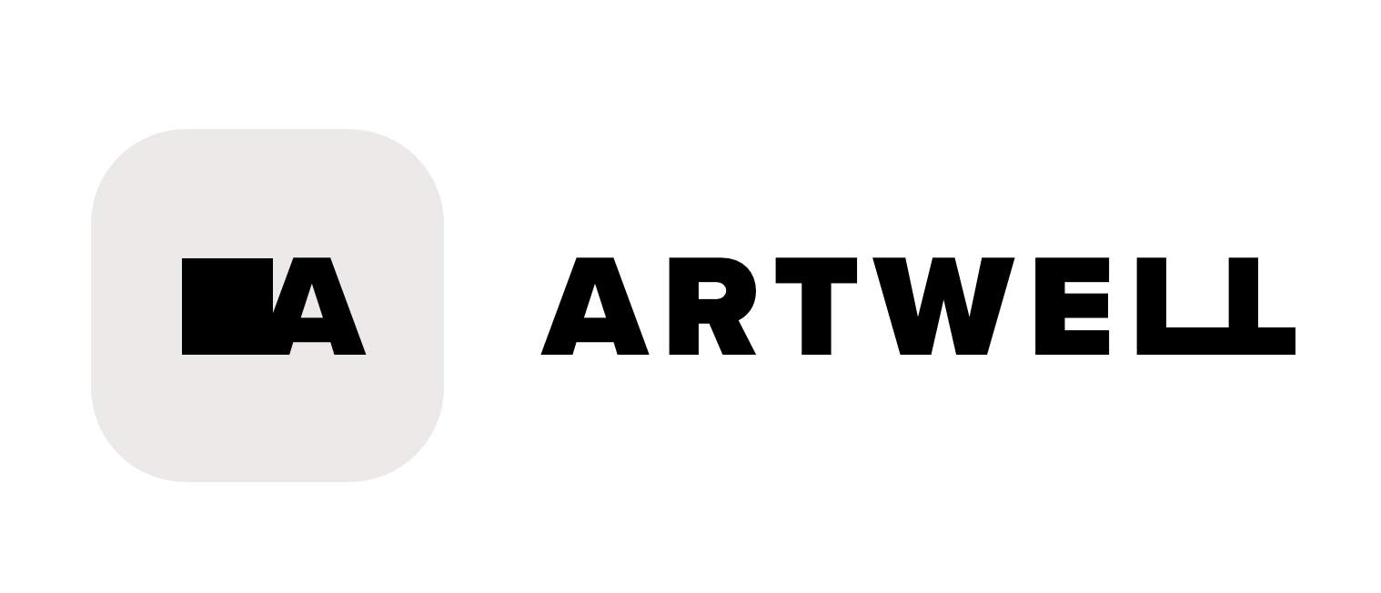
The name, Artwell, was selected from a variety of options such as Art Ally, Open Art, and Artable. It's a placeholder name that aims to make the clear communication that the app is about art, while also connecting art to a happy and pleasant experience.
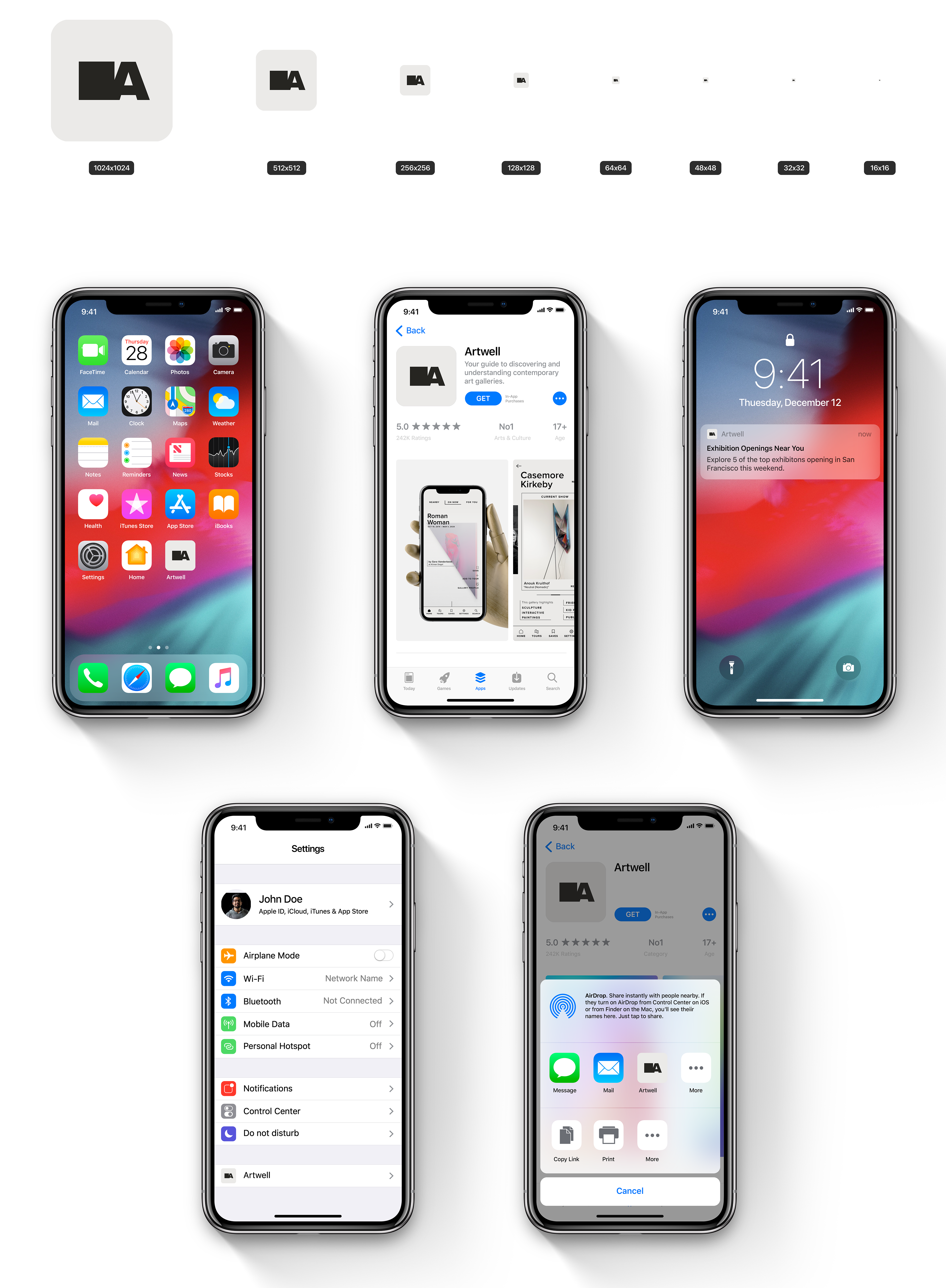
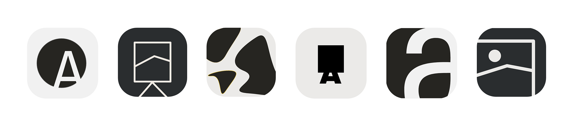
The icon was iterated from explorations on simplicity and basic art iconography. a few options were developed by playing with the letter “A” in the branded typography and simple shapes such as squares and ambiguous blobs. After feedback from classmates and target users, the final icon was crafted from a square connected to an “A”. The square represents the blank canvas artists often start their work with, as well as a metaphorical space for users to imagine any type of art within. The “A” is strategically connected to the square to symbolize the connections this app provided for galleries and users.
FINAL ICON & NAME: