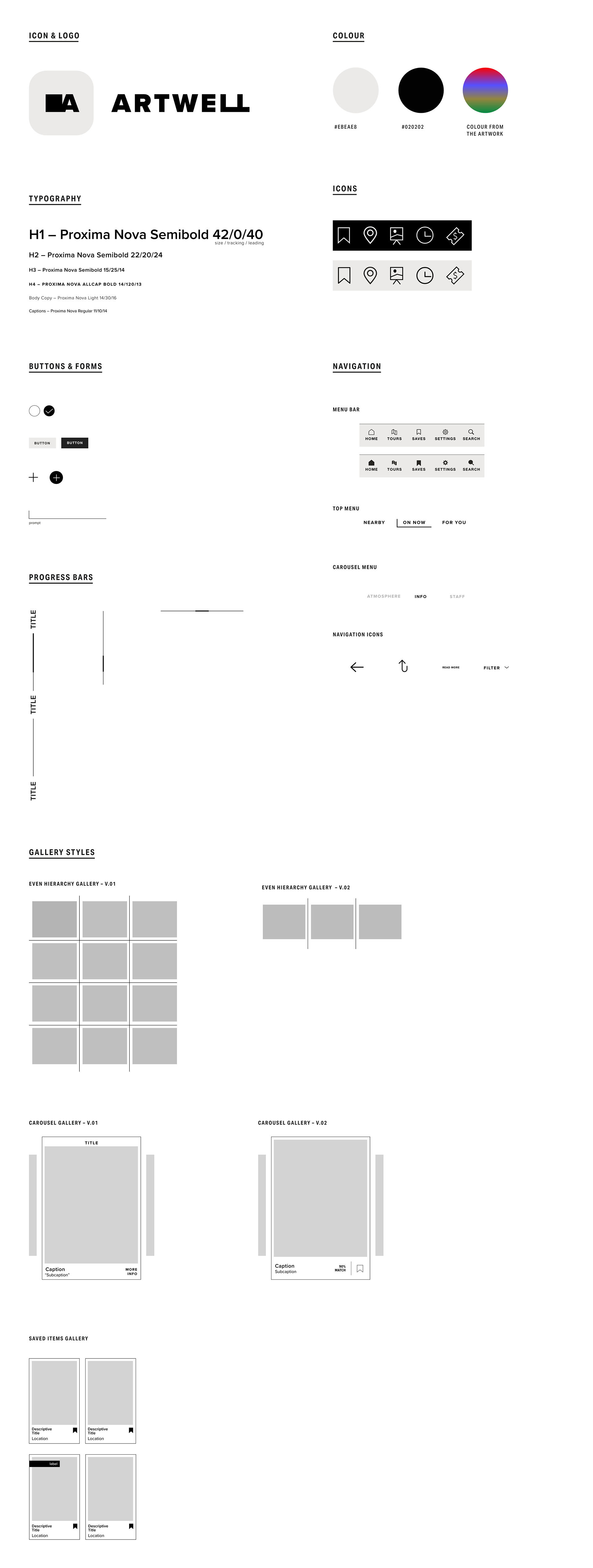
Guided by the design principles, a visual system was crafted to articulate the applications intent of being user friendly and adaptable to the many preferences of art. A soft black and white colour palette was used to allow the colours of the various artwork pop. The colour palette also nods to the strategic black and white aesthetics of an art gallery, but with the subtle addition of warmth to soften up the overall palette and make it more approachable. Simplicity in the iconography, component styling, and navigation graphics was prioritized to ensure users can easily journey throughout the app without complications.
“Confident Boosting” is a top design principle, so it was important to prioritize a clear and informative tone & voice. The app also aims to have a friendly voice without sounding patronizing. The tone is set to build confidence in the users by providing clarity and information, without sounded pretentious.
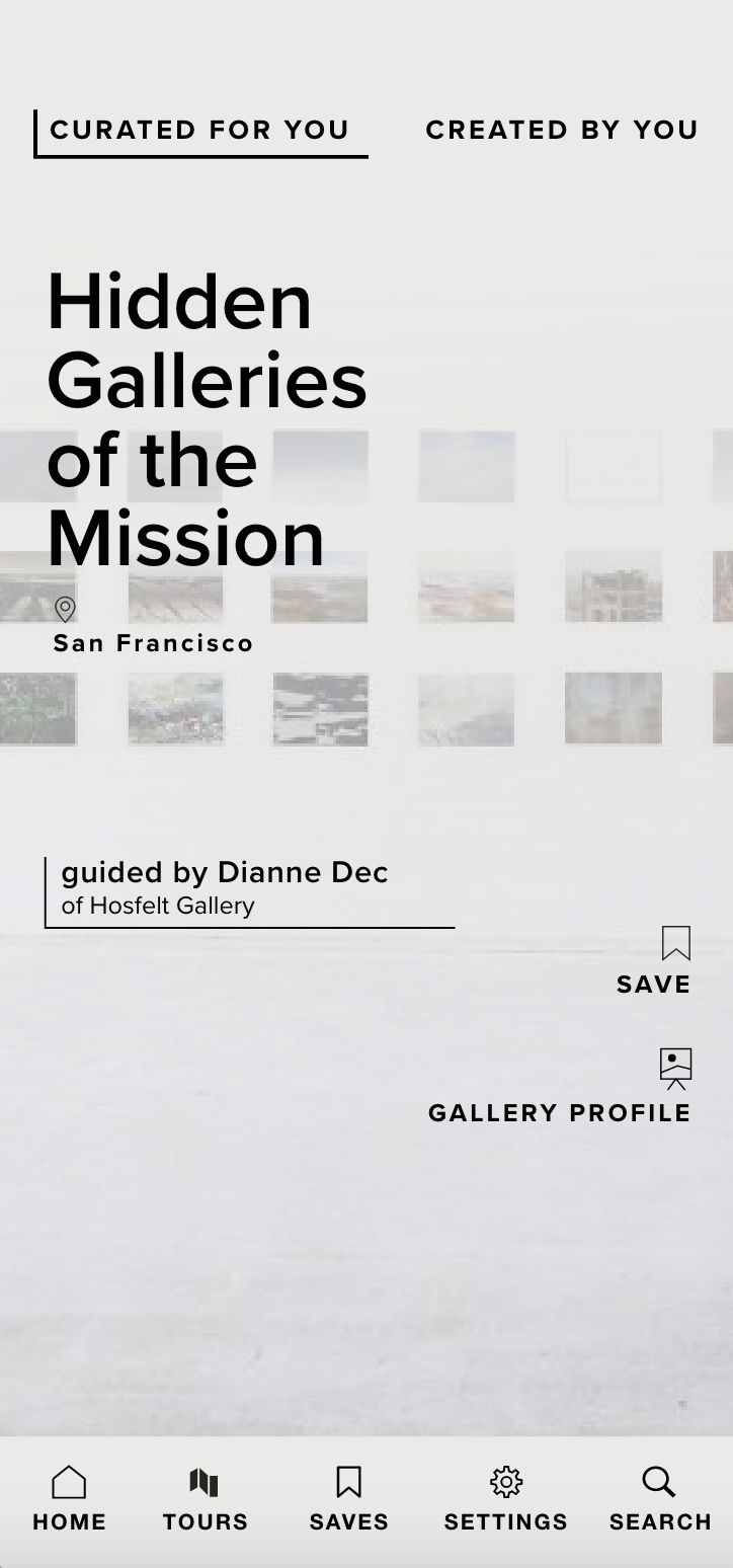
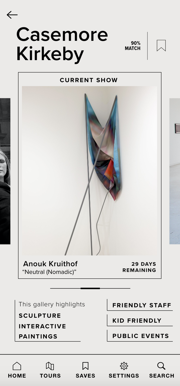
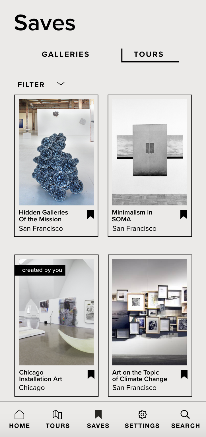
SAMPLE SCREENS: